


Understanding Custom Hooks in React: Some common applications of custom hooks


Hooks are very powerful tools for building applications with React. They provide an easy way to add and improve functionality in React applications. However, React only provides built-in hooks for specific purposes. This can be rather limiting especially when building complex applications with different functionalities.
Custom hooks provide a solution to this, allowing developers to create hooks tailored to the specific needs of their application. Custom hooks allow you to build reusable functions for different parts of your project. This keeps your code organized and simple by separating complex business logic from specific component details.
Creating and using custom hooks is easy when you understand the basic idea. This article demonstrates how to create and apply custom hooks in React by exploring two common applications of custom hooks in React apps.
Note: This article is aimed at beginner to mid-level developers who are already familiar with the fundamentals of React and Javascript including setting up a React application and using basic React hooks like useState.
Getting Started With Custom Hooks
React specifies some rules for creating custom hooks. First, to create a custom hook, you need to create a file with “use” as a prefix. For example, if you're creating a hook to fetch data, you could name it 'useFetch.' What comes after 'use' is really up to you, but it's good to pick a name that explains what the hook does. Also, as with built-in hooks, custom hooks can only be called within react components or other hooks.
After creating the file, you need to create a function with the same name where you apply the logic for your hook. After applying the logic you return what values or functions you want to use in your components and export the hook
function useCustomHook() {
    // Custom hook logic

    return {
        someValue,
        someFunction
    }
}

export default useCustomHook;
To use a custom hook, you need to import the hook in your component and extract the values and functions using a destructuring assignment.
function MyComponent() {
    const { someValue, someFunction } = useCustomHook();
    return (
        //use the value and function
    )
}
Now your custom hook is ready to be used. After you add in the logic of course.
Let's take a look at our first custom hook
Custom Hook for Toggling useToggle
We can create a custom hook to handle multiple toggle actions across different components in our application. This shows a highly practical application of custom hooks as it simplifies our code and eliminates the need for unnecessary repetitions. The useToggle hook is simple.
The code below shows the useToggle custom hook.
import { useState } from 'react';

const useToggle = (initialValue) => {
  // State variable to hold the current toggle value
  const [value, setValue] = useState(initialValue);

  // Function to toggle the current value between true and false
  const toggle = () => {
    setValue((prevValue) => !prevValue);
  };

  // Return the current value and toggle function as an object
  return { value, toggle };
};

export default useToggle;
We define the useToggle function, which takes a initialValue parameter, which we will set to false by default. Then we use the useState hook to create a state variable (value) and a function (setValue) to update that variable. The initial state is set to the provided initialValue.
The toggle function uses the setValue function to toggle the current state. We pass an arrow function into setValue which reverses the state value based on the current state. Finally, to be able to access the function and the state we created from our component, we return the current value and the toggle function.
Now the useToggle hook can be used wherever we need to use a toggle function in our entire application. In this example, we use it to create a simple dark mode/light mode toggle and a simple navigation toggle.
import React from 'react';
import useToggle from './useToggle';
const NavMenu = () => {
  return (
          <ul className="navbar">
              <li>Link 1</li>
              <li>Link 2</li>
              <li>Link 3</li>
              <li>Link 4</li>
              <li>Link 5</li>
          </ul>
  )
}
const Toggle = () => {
  const { value: isDarkMode, toggle: darkToggle } = useToggle(false);
  const { value: isOpen, toggle: navToggle } = useToggle(false);


  // Apply styles based on the value of isDarkMode
  const appStyles = {
    background: isDarkMode ? '#1a1a1a' : '#ffffff',
    color: isDarkMode ? '#ffffff' : '#000000',
    height: '500px'
    // Add other styles based on the dark mode state
  };
  return (
    <main style={appStyles}>
      <header>
        <button onClick={darkToggle}>{ isDarkMode ? `Light Mode` : `Dark Mode`}</button>
        <button onClick={navToggle}>{ isOpen ? `Close Menu` : `Open Menu`}</button>
      </header>
      {isOpen && <NavMenu />}

    </main>
  );
};
The application of the useToggle hook is quite simple. First, we import the hook into our component. In the main toggle component, we extract the value and the toggle function from the hook. Since we want to use the toggle function in two different actions, we create two instances of the toggle functionality from the hook. In the first instance, isDarkMode holds the current value of the toggle, indicating whether dark mode is active or not. darkToggle holds the function that toggles the dark mode state. The second one isOpen holds the current value of whether the navigation menu is open. navToggle holds the function that toggles the navigation menu state. In both instances, the value is set to false by default.
Next, we use appStyles to define the styles of the component using a ternary operator. If darkToggle is true, we set a dark background with light text; otherwise, the styling defaults to a light background with dark text.
In the displayed component we apply the styles defined in appStyles to the wrapper div. We then create two buttons to toggle the dark mode and the nav menu by setting their onClick attribute to darkToggle and navToggle respectively. We use a ternary operator to show button text according to whether dark mode or light mode is active for the dark mode toggle, and 'open' or 'close' for the navigation menu toggle. Finally, we display a <NavMenu /> component when the isOpen is true.
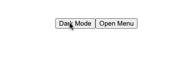
Here's how it works.
We can now use the useToggle hook wherever we need it in the same manner. We only need to modify the code for the particular toggle action.
Now let's take a look at another practical custom hook.
Custom Hook for Form Handling useForm
Custom hooks are useful for handling forms. We can use them to manage form state, form validation, form submission, and other form behaviours.
In this example, we will create a custom hook for a simple registration form. We will use the custom hook to manage the form state, add basic form validation, and handle the form submission. To get started we create a form component and add a form with a name, email, role options, and password field. We give each form input a unique name.
function Form() {
  return (
    <form>
        <div>
            <label>Full Name:<sup>*</sup> </label>
            <input
                name="name"
                type="text"
                placeholder="Enter your name"
                value="" />
        </div>
        <div>
            <label>Email Address:<sup>*</sup> </label>
            <input
                name="email"
                placeholder="Enter your email"
                value="" />
        <div>
            <label>Role:<sup>*</sup> </label>
            <select
                name="role"
                value="">
                <option value="">Select Role</option>
                <option value="admin">Admin</option>
                <option value="editor">Editor</option>
                <option value="contributor">Contributor</option>
            </select>
        </div>
        <div>
            <label>Password:<sup>*</sup> </label>
            <input
                type="password"
                name="password"
                placeholder="choose a password"
                value=""
                />
        </div>
        <input type="submit" value="Register" />
    </form>

  )
}
export default Form;
Now we build our custom hook. We create a file named useForm and add all the form handling logic.
function useForm(initialValues, initialChange) {

  // State variables for form values, change tracking, and submission status
  const [values, setValues] = useState(initialValues); // manage the values for the form state
  const [isChanged, setIsChanged] = useState(initialChange); // Track whether each field has been changed
  const [isSubmitted, setIsSubmitted] = useState(false); // Track form submission status

}
We start by defining the useForm function, which accepts two parameters: initialValues to set the initial values for each form field, and initialChange to set the initial change state of each form field (this is used for the form validation). We initialize the state for the form input values(values) and a function to update the values(setValues) using useState hook and we set the default value to initialValues.
Next, we create a state named isChanged that tracks changes in the form fields and a function to update it setIsChanged. We initialize it with the values provided by initialChange.
Finally, we create a state variable isSubmitted to check and update the form submission status using the state function setIsSubmitted.
Next, we handle the change event.
  // Function to handle input changes and update form values
  const handleChange = (e) => {
    const { name, value } = e.target;
    // Update the corresponding form value
    setValues((prevValues) => ({
      ...prevValues,
      [name]: value,
    }));
    // Update the corresponding field as changed
    setIsChanged((prevValues) => ({
      ...prevValues,
      [name]: true,
    }));
  };
In the handleChange function, we use destructuring assignment to extract the name and value properties from the event target, which represents the form input that triggered the event.
Next, we update the values state using the setValues function provided by the useState hook in React. The setValues function takes an updater function as an argument, which receives the previous state (prevValues) as its parameter.
Inside the updater function, we use the spread operator (...prevValues) to create a copy of the previous values state object. This ensures that we maintain the existing state properties without changing the original state.
The dynamic key [name]: value within the new state object allows us to selectively update a specific part of the values state based on the name attribute of user input obtained from the event, and value represents the updated value entered by the user.
In the same way, we update the values of the isChanged state for each form field. We set it to true indicating that the form field has been changed. We use this to define form errors when the user updates an input field.
Finally, we handle the form submission.
   // Function to reset form state to initial values
  const resetForm = () => {
    setIsChanged(initialChange);
    setValues(initialValues); // reset values
    setIsSubmitted(false); // reset submission status
  }

  // Function to handle form submission
  const handleSubmit = (e) => {
    e.preventDefault();
    setIsSubmitted(true);
  };
We create a resetForm function, where we call the state updater functions setValues and setIsChanged and pass in the initialValues and initialChanged, respectively. This is used to reset the form values and the isChanged state back to default. We also reset the submit state to false so that the form is marked as not submitted.
handleSubmit is the function that handles the form submission. We first prevent the default form behavior. Here we set the submit state to true to indicate that the form has been submitted.
To use our custom hook in the form we have to return all the state variables and functions.
return {
    values,
    isChanged,
    isSubmitted,
    handleChange,
    handleSubmit,
    resetForm
  };
}
Here's a final look at the useForm custom hook.
import { useState } from "react";

function useForm(initialValues, initialChange) {
  // State variables for form values, change tracking, and submission status
  const [values, setValues] = useState(initialValues); // manage the values for the form state
  const [isChanged, setIsChanged] = useState(initialChange); // Track whether each field has been changed
  const [isSubmitted, setIsSubmitted] = useState(false); // Track form submission status
  // Function to handle input changes and update form values
  const handleChange = (e) => {
    const { name, value } = e.target;
    // Update the corresponding form value
    setValues((prevValues) => ({
      ...prevValues,
      [name]: value,
    }));
    // Mark the field as changed
    setIsChanged((prevValues) => ({
      ...prevValues,
      [name]: true,
    }));
  };
  // Function to reset form state to initial values
  const resetForm = () => {
    setIsChanged(initialChange);
    setValues(initialValues); // reset values
    setIsSubmitted(false); // reset submission status
  }

  // Function to handle form submission
  const handleSubmit = (e) => {
    e.preventDefault();
    setIsSubmitted(true);
  };
  return {
    values,
    isChanged,
    isSubmitted,
    handleChange,
    handleSubmit,
    resetForm
  };
}
export default useForm;
Now in our form component, we have to extract these states and functions returned from our custom hook. Here's the updated form component:
import React from 'react';
import useForm from '../Hooks/useForm';


function Form() {
    // Define initial values and change status for form fields
    const initailValues = {
        name: "",
        email: "",
        role: "",
        password: ""
    }
     const initialChange = {
        name: false,
        email: false,
        role: false,
        password: false
     }
    // Destructure values and functions from useForm custom hook
    const {
        values, // current form field values
        isChanged, // value indicating if a field has been changed
        isSubmitted, // Value indicating if the form has been submited
        resetForm, // function to reset the form
        handleChange, // function to handle the form change
        handleSubmit, // function to handle the form submission
     } = useForm(initailValues, initialChange); // Initialize useForm with initial values


    // Determine if form is valid based on current values
    const isValid = values.name && values.email && values.role !== "" && values.password.length >= 7;

    // Handle form submission if form is submitted and valid
    if (isValid && isSubmitted) {
    alert('your form was successfully submitted', values.name, values.email, values.role);
    resetForm();
    }

    // Render registration form
  return (
    <form onSubmit={handleSubmit}>
        <div>
            <label>Full Name:<sup>*</sup> </label>
            <input
                name="name"
                type="text"
                placeholder="Enter your name"
                value={values.name}
                onChange={handleChange}/>
            {/* Display error message if name field is empty */}
            {(isChanged.name || isSubmitted) && !values.name ? (<p>Name is required</p>) : null}
        </div>
        <div>
            <label>Email Address:<sup>*</sup> </label>
            <input
                name="email"
                placeholder="Enter your email"
                value={values.email}
                onChange={handleChange}/>
                {/* Display error message if email field is empty and the form is submitted */}
            {(isChanged.email || isSubmitted) &&  !values.email ? (<p>Email is required</p>) : null}
        </div>
        <div>
            <label>Role:<sup>*</sup> </label>
            <select
                name="role"
                value={values.role}
                onChange={handleChange}>
                <option value="">Select Role</option>
                <option value="admin">Admin</option>
                <option value="editor">Editor</option>
                <option value="contributor">Contributor</option>
            </select>
            {/* Display error message if role field is empty and the form has been submitted */}
        {(isChanged.role || isSubmitted) && !values.role ?  (<p>please select a role </p>) : null}
        </div>
        <div>
            <label>Password:<sup>*</sup> </label>
            <input
                type="password"
                name="password"
                placeholder="choose a password"
                value={values.password}
                onChange={handleChange}
                />
            {/* Display error message if password field is empty and the form has been submitted */}
            {(isChanged.password || isSubmitted) &&  values.password.length < 7 ? (<p>password must be longer than 7 characters</p>) : null}
        </div>
        <input type="submit"  value="Register" />
    </form>

  )
}


export default Form
First, we import the useForm hook and define the initial values for all the fields with initalValues as well as the initial change state with initialChange and pass them as arguments into the useForm hook.
initialValues is an object with all the form fields set to empty strings. initalChange is an object with all the form fields set to false
In the form, we set onSubmit attribute to the handleSubmit function. The value attribute of each field is set to values.fieldname which is the key we used when defining the initialValues. Also, we set the onChange attribute to the handleChange function. To display errors we first check if the isChanged state is true for the specific field (indicating that that field has been updated) or if the isSubmitted state is true (indicating that the form has been submitted. Then if the field is empty then we display an error telling the user to fill the field.
Now we have a custom hook that manages a simple registration form with basic form validation and form submission. This declutters the form component and makes the code neater. We can also reuse this hook for other forms in the same manner.
In this article, we demonstrated how to create and apply custom hooks. We explored two practical use cases for custom hooks: a custom hook for toggling states and a custom hook for form handling. You can find the entire code on GitHub.
Custom hooks in React are like personal assistants for developers. With custom hooks, you can share logic across components, keeping your code clean and organized. It's a tool that helps you to build better, more efficient applications.
When building a custom hook it is important to make sure that the hook is reusable. Your hook should work consistently across different components without having to alter it.
If you haven't already, now's the perfect time to dive into custom hooks and take your React applications to a whole new level.